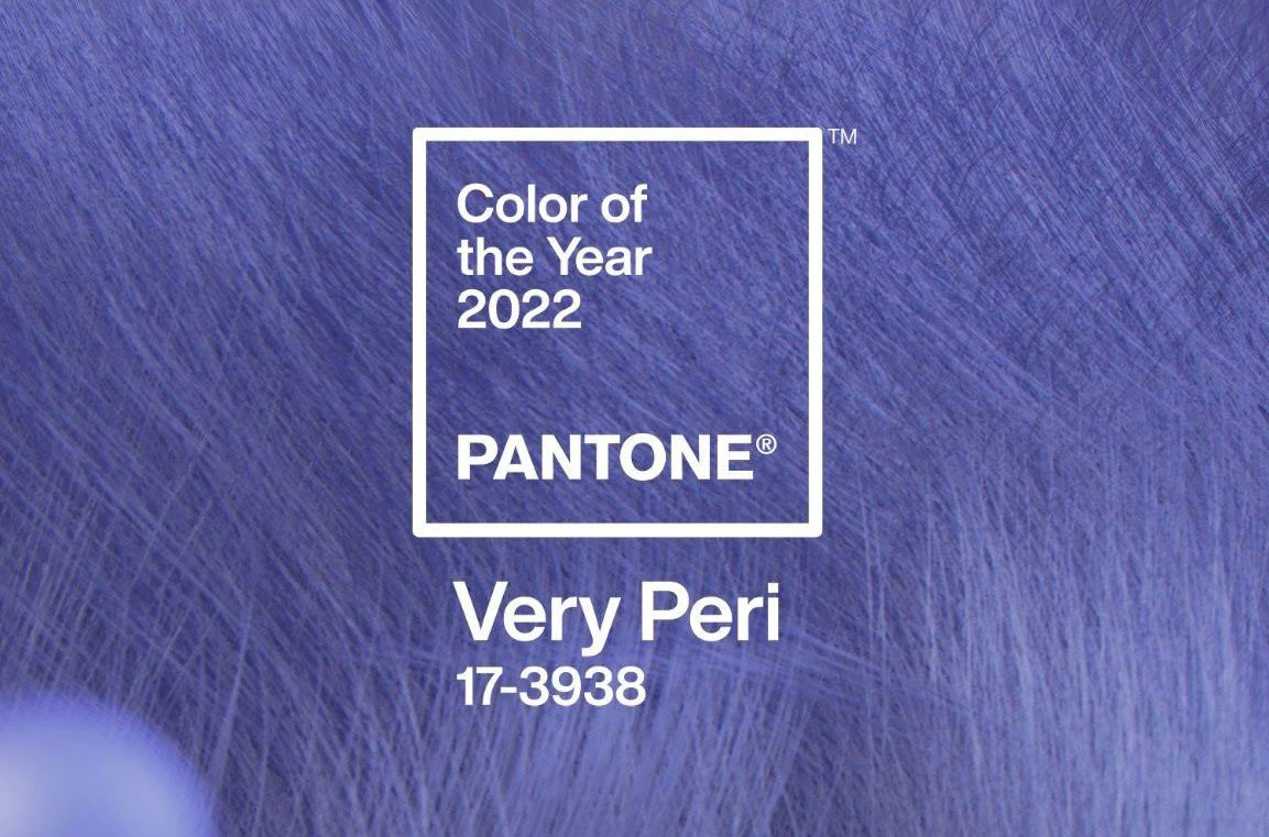
Introducing Very Peri
Pantone is a giant in the design world, best known for its Pantone Matching System. Colour enthusiasts and creatives eagerly await the annual reveal of Pantone colour of the year. In addition, brands and manufacturers make many business-critical decisions based on Pantone's universal colour language.
Eyeweb knows the importance of colour in brand design and customer purchasing decisions, so we were excited to see such a digitally influenced colour of the year reminiscent of Twitch's live streaming platform and its signature colours. By keeping track of the year's colour, Eyeweb can keep up to date with trends and predictions.
According to Pantone, the "courageous" periwinkle shade 17-3938 Very Peri encourages personal inventiveness and creativity, which is great during a time of rebirth after a turbulent few years.
The Pantone colour of the year award is a prestigious design choice that the company predict will be the trend of colour for that year, widely used amongst brands, manufacturers, interior designers, clothing outlets and trends. This is the first year the company has specifically created a new colour for this award.
Why Is Colour Important?
Very Peri is considered the "happiest and warmest of all the blue hues" as it "blends the faithfulness and constancy of blue with the energy and excitement of red".
Very Peri is set to reinforce the 90's rebirth of futuristic feeling clothes, fashion, and apparel. Pantone claims that Very Peri conveys a sense of credibility and creativity, so it can be used in packaging with confidence. "Whether appearing in a digital fantasy realm or in physical materials, Very Peri exudes a good-natured warmth that quickly engages the eye, making it an ideal shade for many applications graphic and multimedia design and packaging," Pantone says.
Pantone has a vast library of colours used in design projects to help clients achieve exactly the shade they desire and, more importantly, portray the brand they want customers to see and create the emotions they want from their customers to influence purchasing decisions.
Using the Pantone colour catalogue helps Eyeweb communicate with printers universally around the world and removes the risk of discrepancies caused by screen calibration and generally how people see colour differently. In addition, the colour code, system, catalogue, and massive array of colours available allow clients to be excited by choice, inspired and motivated to dig down into what colour means to their business.
Collaborations with Microsoft and Blockchain
Pantone has built a range of design tools to make it easy for designers to work with the colour. You can use their Pantone Connect digital platform to find four colour palettes that you can use in your projects.
Pantone teamed up with Microsoft to customise their products with Very Peri. You can find examples of this colour in use in Microsoft Teams, Windows wallpapers and Edge.
To explore the digital art space, Pantone has partnered with Tezos. The blockchain network aims to help generate renewable energy for all its users. In addition, Very Peri will be collaborating with Paris-based artist Polygon1993 for a new gallery opening. Polygon1993 will work on pieces based on Very peri work and includes some of the same themes in their practice.
"The Pantone Colour of the Year reflects what is happening in our global culture, expressing what people are looking for that colour can hope to answer," says Pantone Colour Institute vice president Laurie Pressman.
"Creating" a colour, for the first time in the colour of the year's history, is a direct response to "global innovation and transformation".
Past Pantone Colours of the Year
Popular colours of the Pantone award in the past have included: "Ultimate grey" (2021), "Classic Blue" (2020), "Living Coral" (2019), and "Ultraviolet" (2018).
The colour PANTONE 17-3938 Very Peri symbolises our time and the transformation we are going through. We're coming out of isolation, and our notions and standards are changing. Physical and digital are now merging in new ways. Digital design helps us explore entirely new possibilities that may only have been possible with a lot of expenses in the past time. As the metaverse becomes more prevalent, and gaming trends take on an all-new high, PANTONE 17-3938 Very Peri helps to illustrate the fusion of modern life and how colour trends in the digital world are manifested in physical worlds.